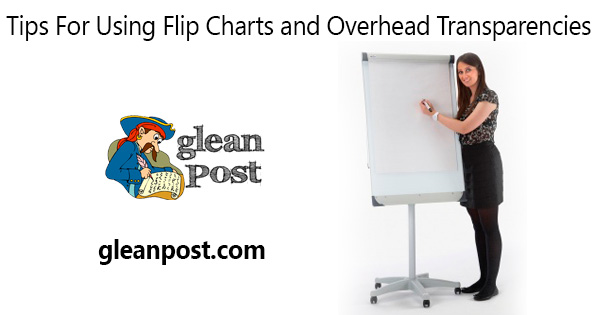
Flip charts can be used to create teaching-learning resources that are easily understood and easy to use in the student-centered classroom. Flip charts continue to be popular because they are effective,portable,familiar,inexpensive and do not require electricity or telecommunications.The flip chart's main benefits as teaching learning resourced are that they can:
Focus students' attention
Give visual expression to ideas and concepts
Communicate what words can not
promote collaboration between groups
Be developed and used by both teachers and students
Flip charts consist of three simple components:
1.Easel or mechanism to hold a writing surface at eye level
2.Pad or writing surface
3.Writing instrument
Top Ten Tips for using Flip Charts in the Student-Centered Classroom
Top Ten Tips for Teachers and Students in Using Flip Charts as Rich Teaching-learning Resources.
1.It is good,when possible,to prepare flip chart pages in advance.This means viewers do not have to wait while you try to draw things on the page
2.Leave one blank page,at least between each prepared page.This will help make sure that students can add comments,give new thoughts on a topic,and engage in a variety of interactive ways with the content on the flip chart without having to flip through several pages to reach a blank sheet.This is important whether the teacher is using the flip charts with students or students/student groups are presenting flip chart content to other students.
3.If drawing diagrams of charts when presenting content,create light pencil outlines on the flip chart page in advance.The student audience will not be able to see the pre-drawn illustrations-but the presenter will and the finished drawing will look more professional since the draft diagrams and charts can be copied over.
4.It is important to have a conclusion page at the end of the flip chart.The presenter can turn to this page at the end of the presentation and summarize what has been said.
5.The first page of a flip chart presentation should either be blank or have a 'title page',such as the subject of the presentation.In this way,the first page of text not distract students before the presentation begins.
6.On each page that includes key points,leave plenty pf space between the points.This allows the presenter to add in comments from the students(in a different color)as the presentation proceeds.
7.It is important to use big letters(but not capitals)so that students can easily read the writing.Each character should be at least 7 cm.tall.
8.Reserve bright colors for charts and diagrams or for underlining important words or phrases.Basic text should be in a dark color,such as black or blue,so it can be easily seen.
9.If the presenter writes on the flip chart as he/she goes through the talk,he/she should to one side so students can see what has been written.
10.After a formal presentation has finished,the presenter should go back through the flip chart pages and prepare some notes based on what was added during the talk.This information can then be given to the students so they have a record of the event.
Tips For Using Overhead Transparencies
Overhead projectors enlarge the images placed on plastic transparencies and display them on a screen for a room of students to view.Here are several tips regarding the use of transparencies as teaching-learning resources:
1.Clarity:
If you prepare your transparencies ahead of time,you can usually make them neater and more organized than if you were writing on a blackboard or whiteboard.
2.Location.
When you write on transparencies,do so facing the class,so there is no need to worry about turning your back to students.
3.Efficiency:
If you use a computer in your creation of transparencies,you can revise them for further use,easing the preparation for future classes on the same topic.
4.Use "bullet points" rather than full paragraphs.
You will avoid falling into the trap of reading to your audience(a frustrating practice for viewers)and will be reminded of what points you would like to expand upon.
5.Avoid putting too much information on any single transparency.
Each transparency should be used to illustrate a basic concept.If you have a more complicated concept you should use multiple,simple transparencies.
6.Avoid using too many transparencies.
Recommendations include using no more than 10 or 12 transparencies for a one-hour class.Using more can overwhelm students with information and force you to rush through the material rather than develop concepts.
7.Structure our transparencies.
Use headings,understanding,different typefaces,etc.If possible,employ colour to help students see your outline
8.Creativity.
If you have access to a laser printer or copier,you can use them to produce transparencies,allowing you to directly copy graphs,charts


![[PROBLEM SOLVED] How to connect i7S TWS airpods and pair](https://blogger.googleusercontent.com/img/b/R29vZ2xl/AVvXsEhpElfEw68GIV4Btl_ukHD_mzbfAdFh4hiutnxqL0y4uQe_1Gmdl05NR0C0ayLgRgTvfcw6uppkPKfZnXrE02bUDJWkN3H2Dz-1bCF4BuSVUimS63WoRJ-PFFKMGNQFVSbBn541c4ak3vc/w74-h74-p-k-no-nu/How-to-connect-i7S-TWS-airpods-and-pair-%255BPROBLEM-SOLVED%255D.jpg)